Conceca
Year:
2023
Category:
Construction
Deliverable:
Visual Identity, Digital Design
Conceca is an established construction company with a long history in the industry, noted for its ability to develop and build projects simultaneously.
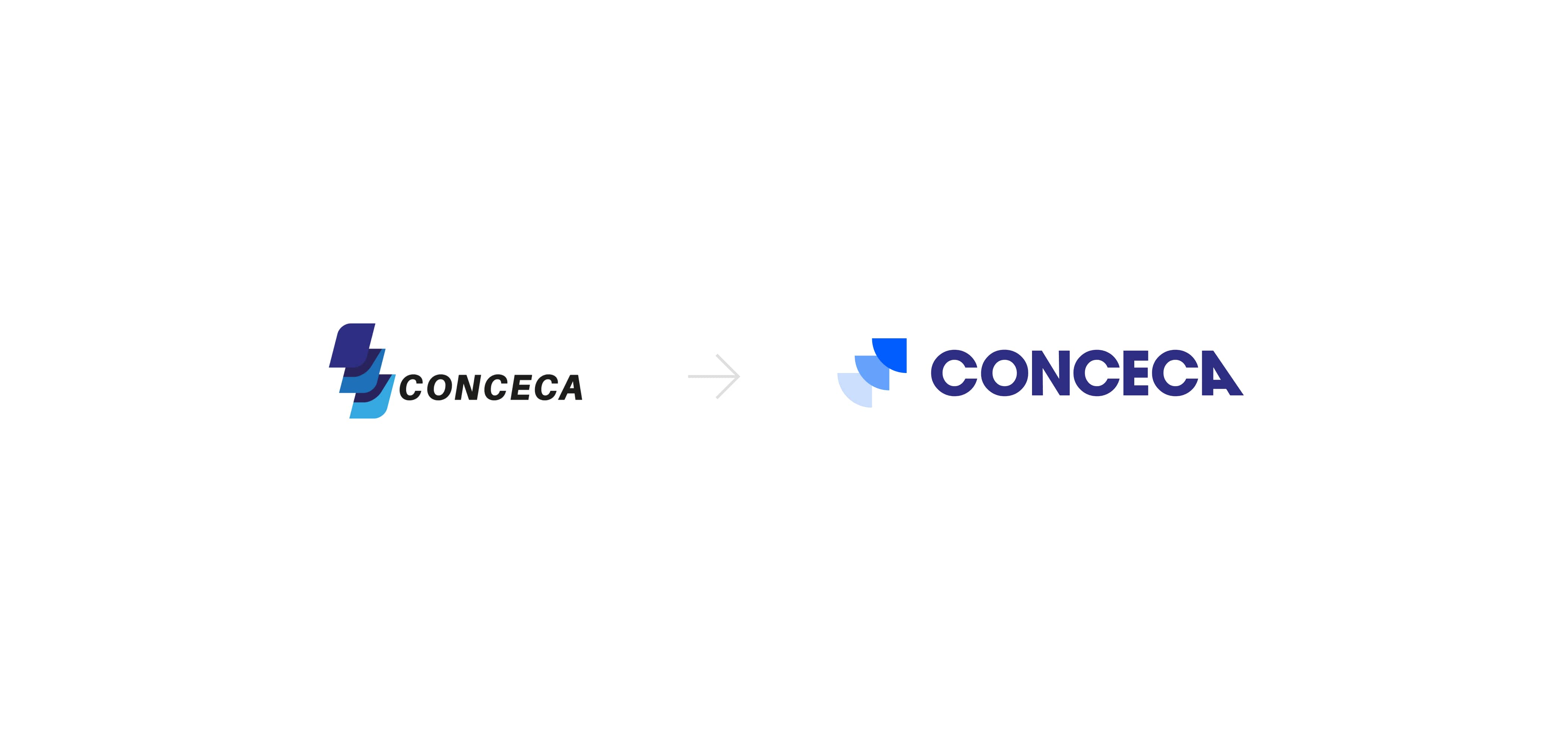
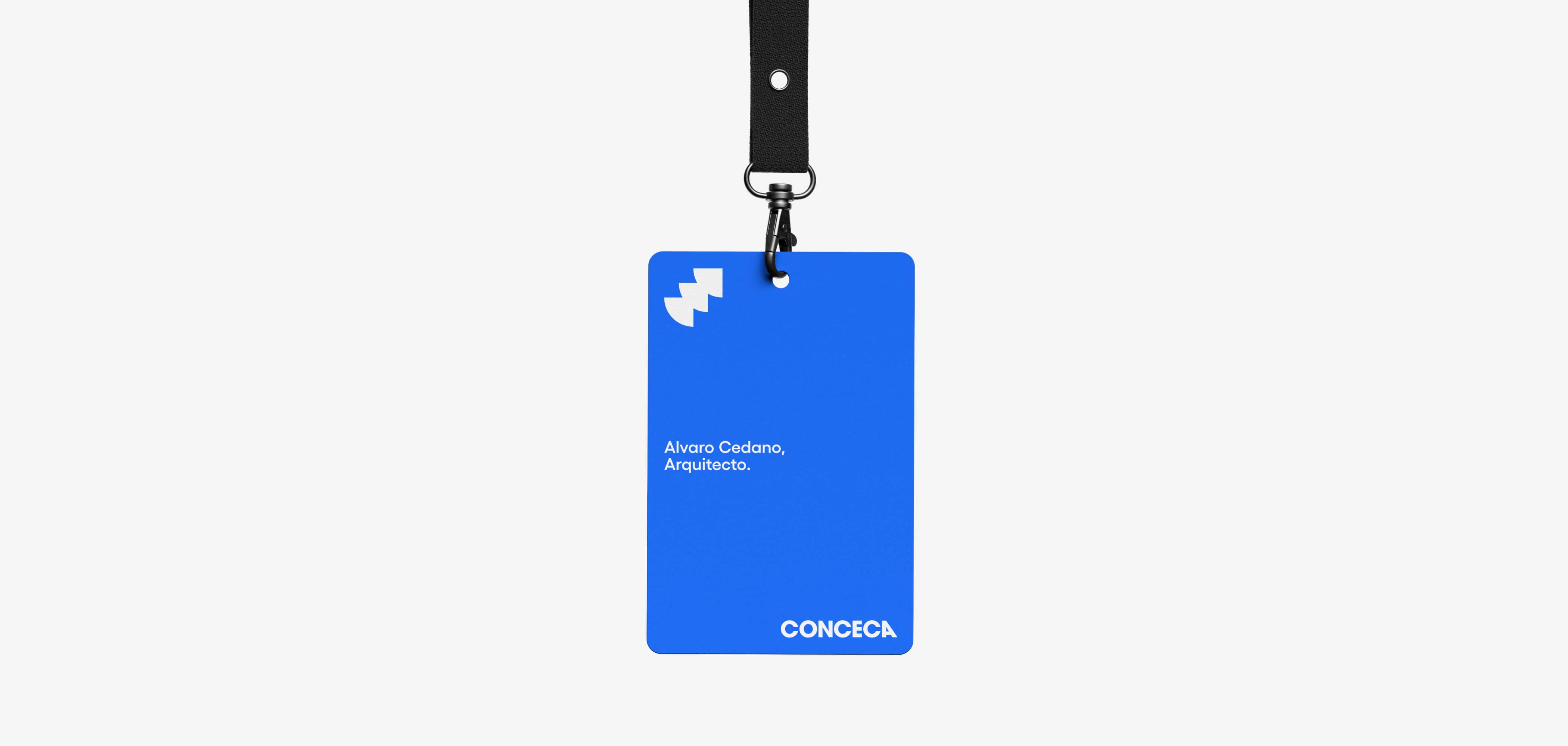
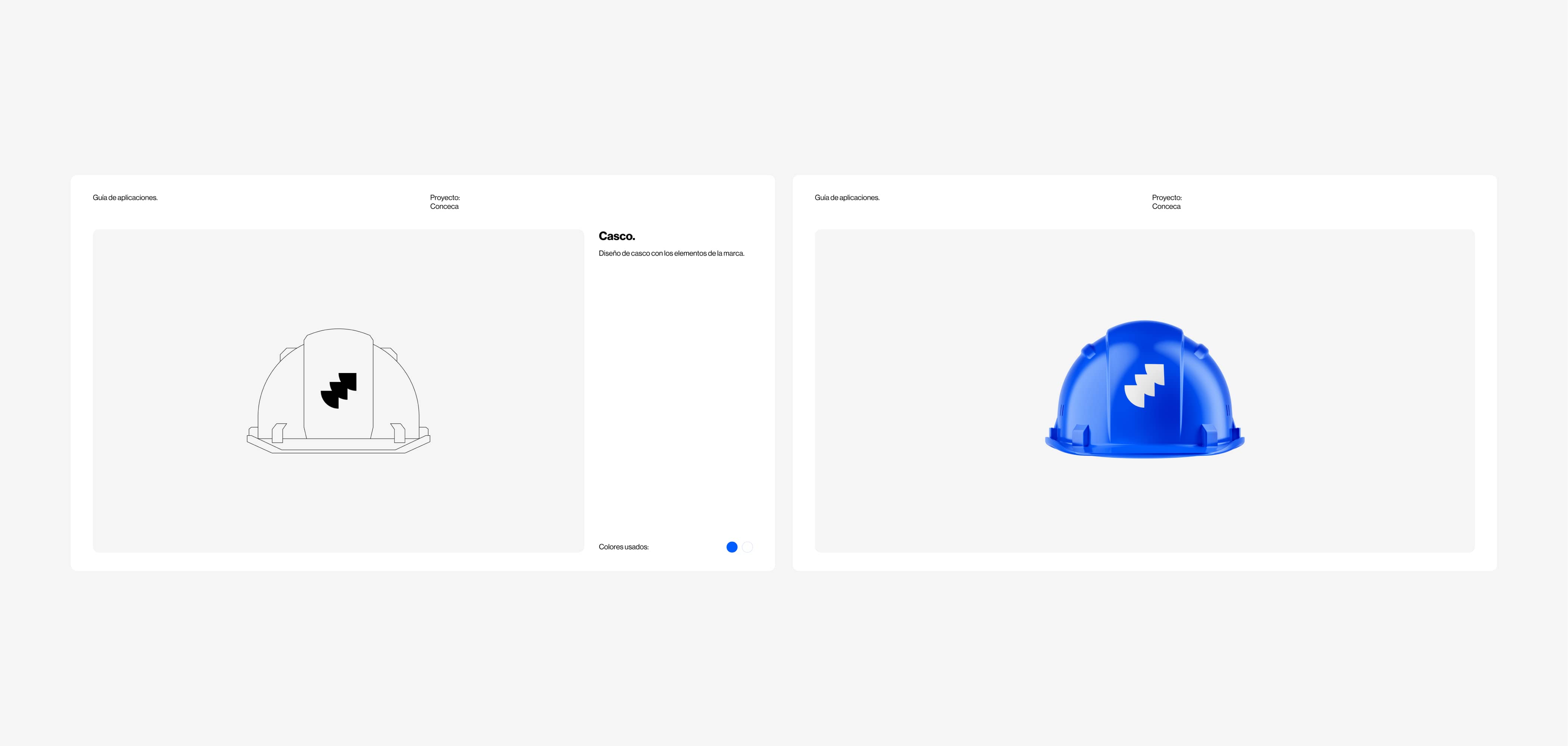
We have touched and updated every element of the previous identity.
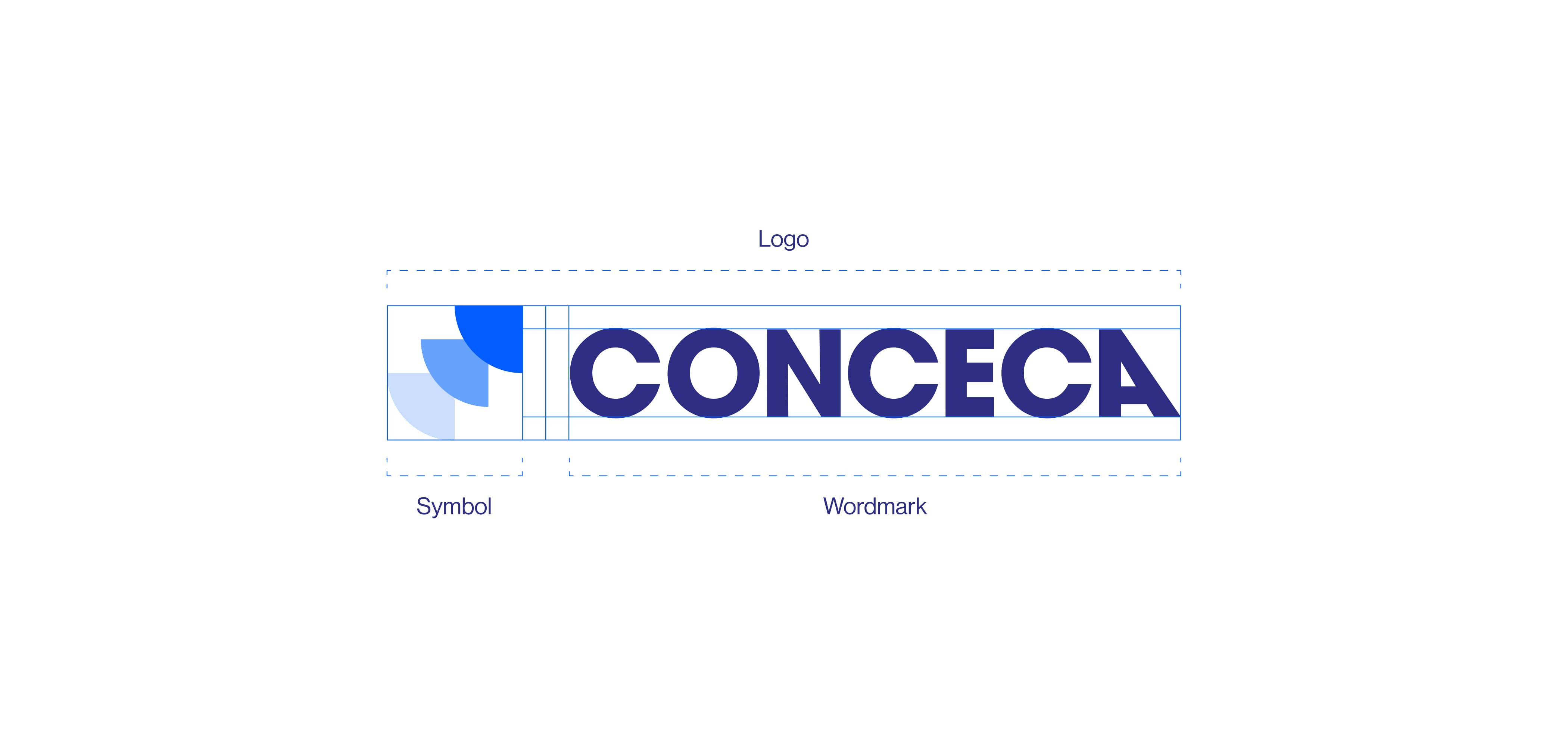
The symbol has been redesigned to represent movement and progress, values with which Conceca identifies. The curved and geometric shapes combine to reflect the harmony and collaboration that characterizes the team. The Wordmark has also been refined to convey clarity and professionalism, ensuring that the name is easy to read and remember.
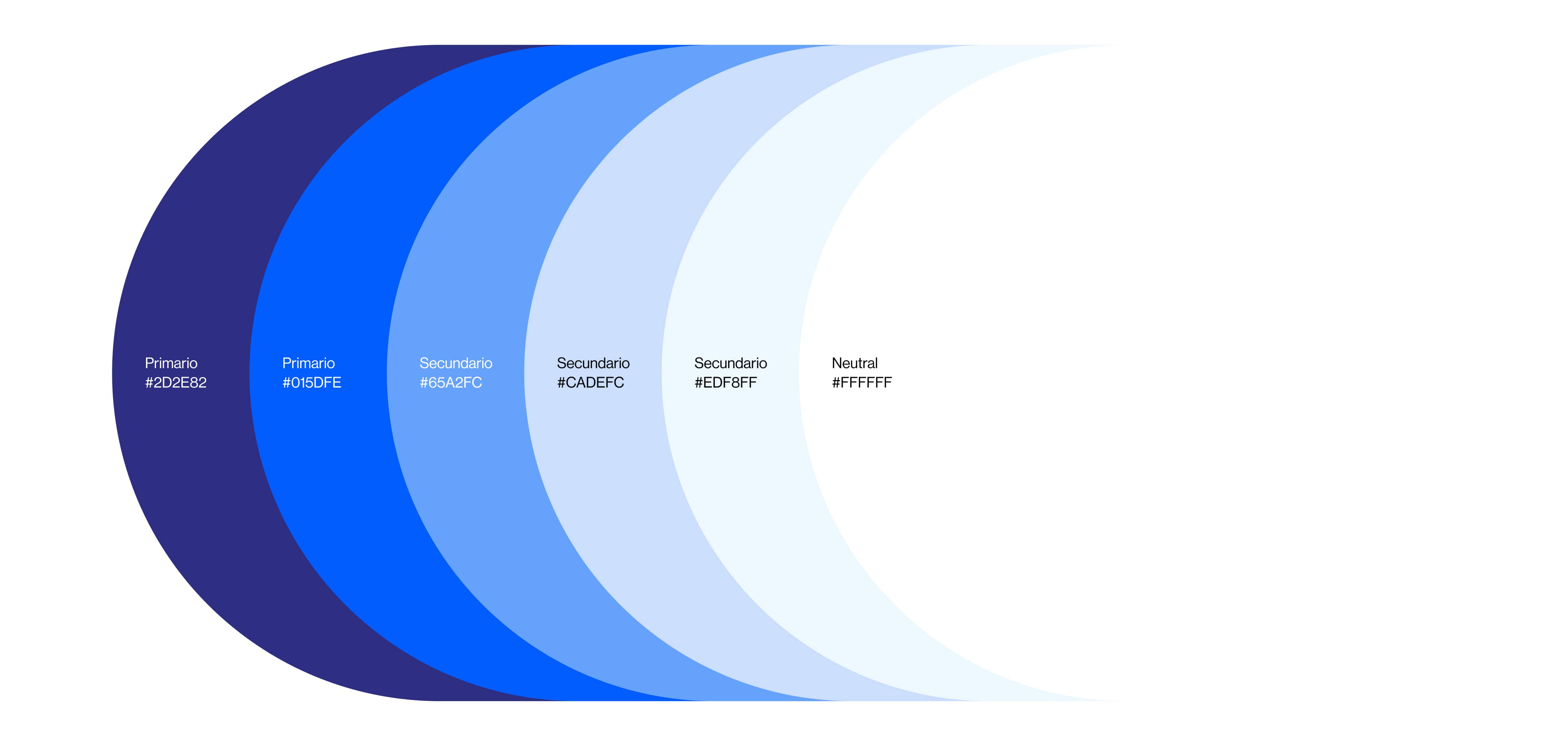
The new color palette evolves from dark, saturated tones to a more vibrant and modern combination of blues. This change symbolizes our renewed energy and commitment to innovation and excellence.
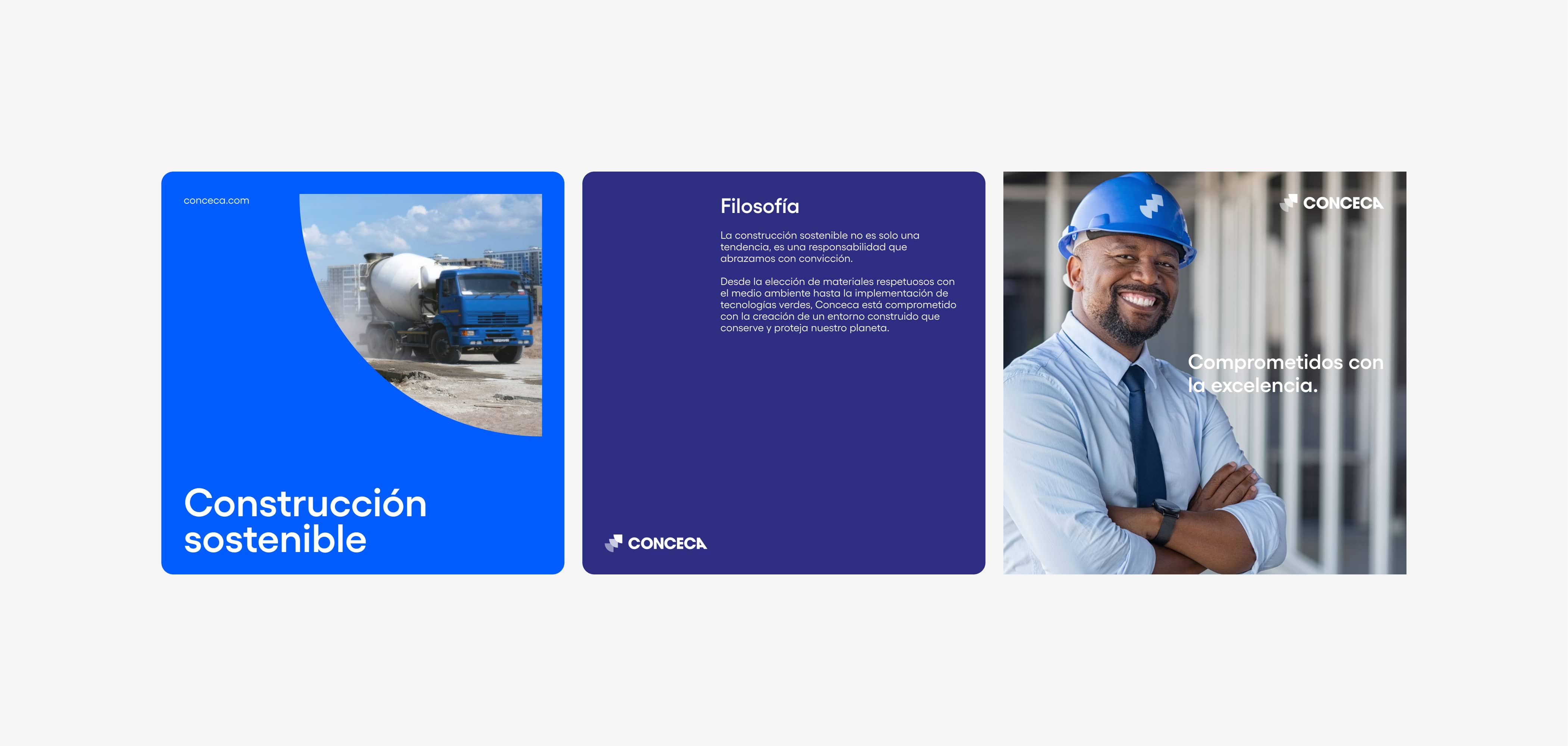
We develop visual and graphic content for their social media platforms, ensuring consistency and a strong visual impact that reinforces the brand's message in each publication.
Similarly, we design informative and visually appealing newsletters that not only effectively communicate company news, but also connect with your audience in an authentic way.
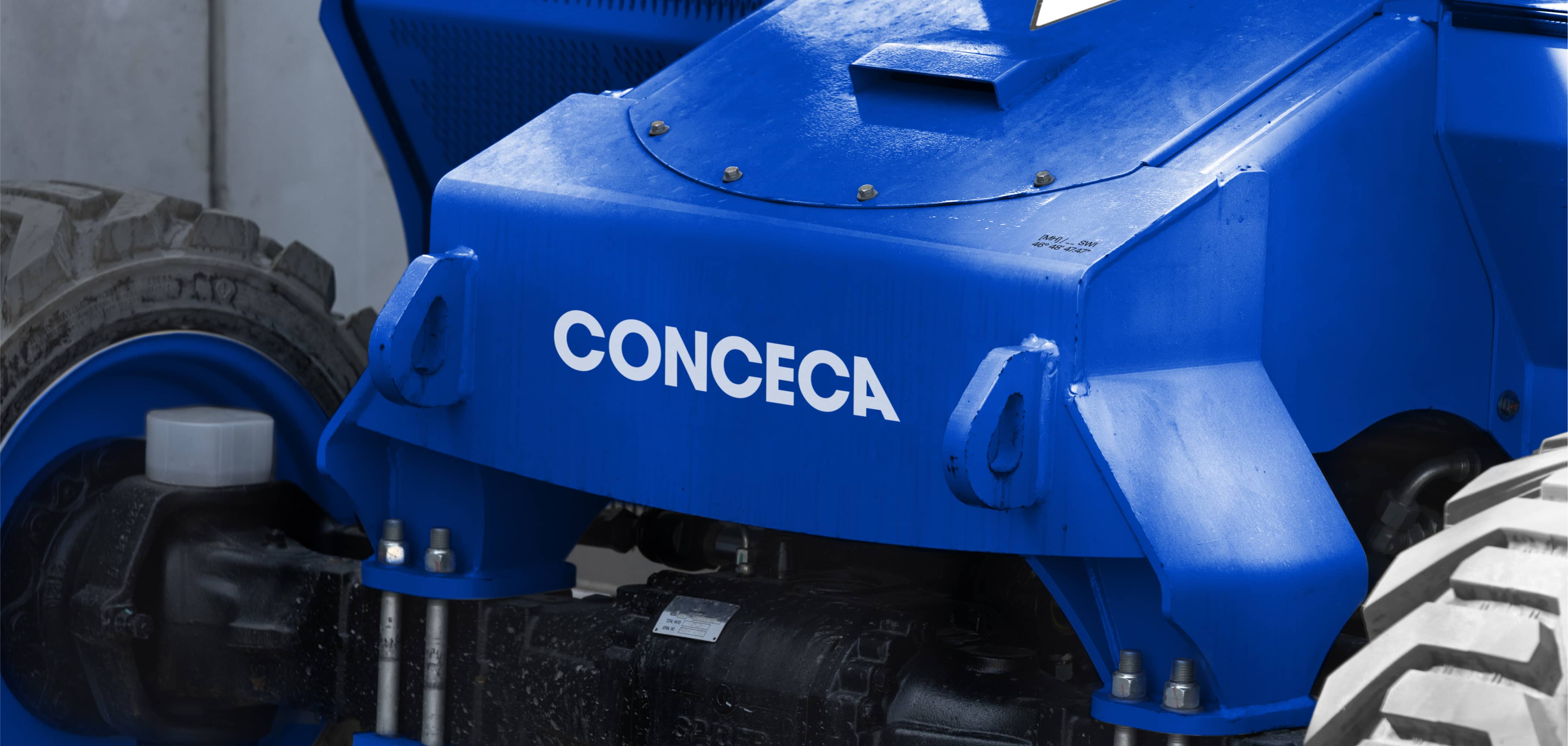
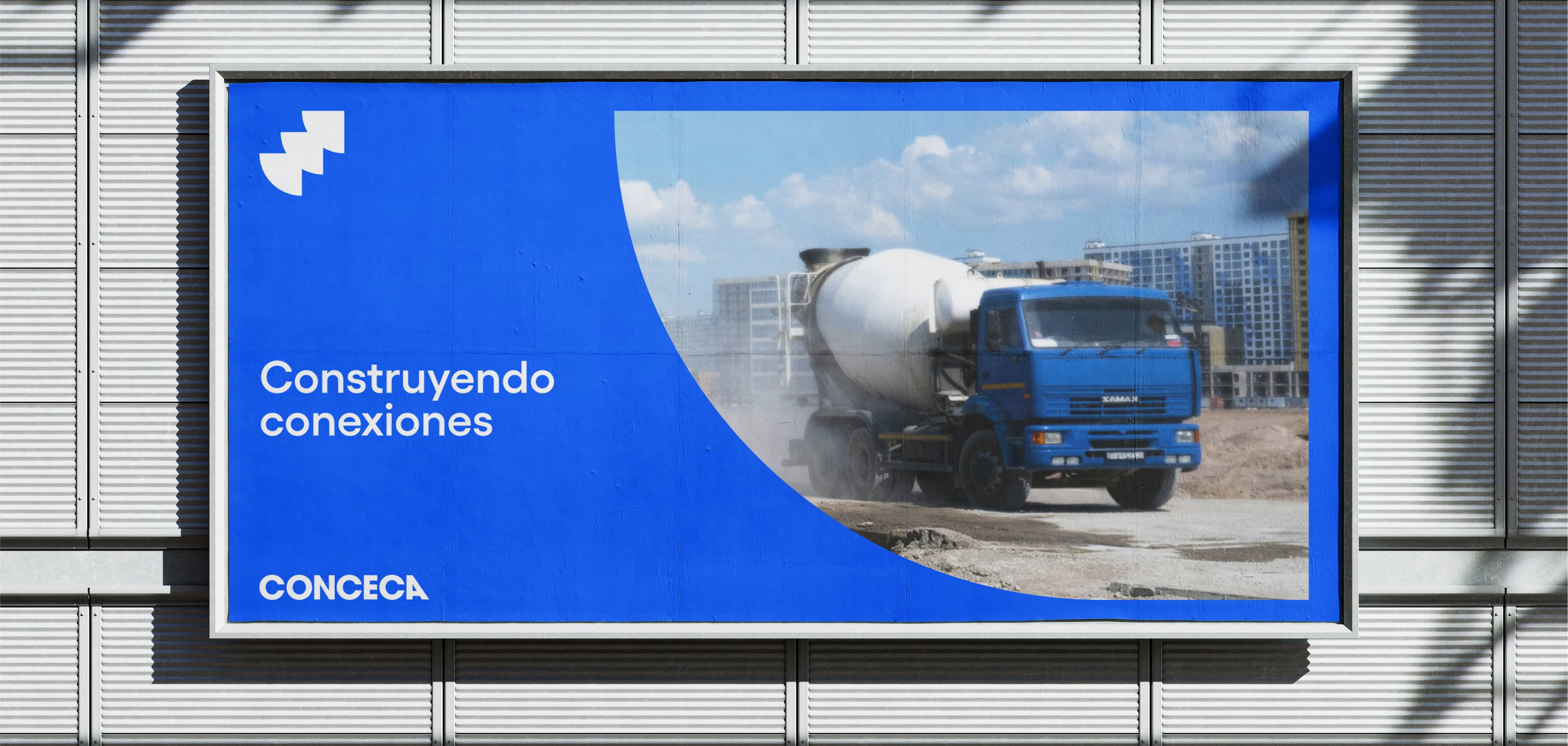
For printed materials, such as billboards, our goal was to create pieces that would stand out for their clarity and professionalism, integrating Conceca's new color palette and typography.
